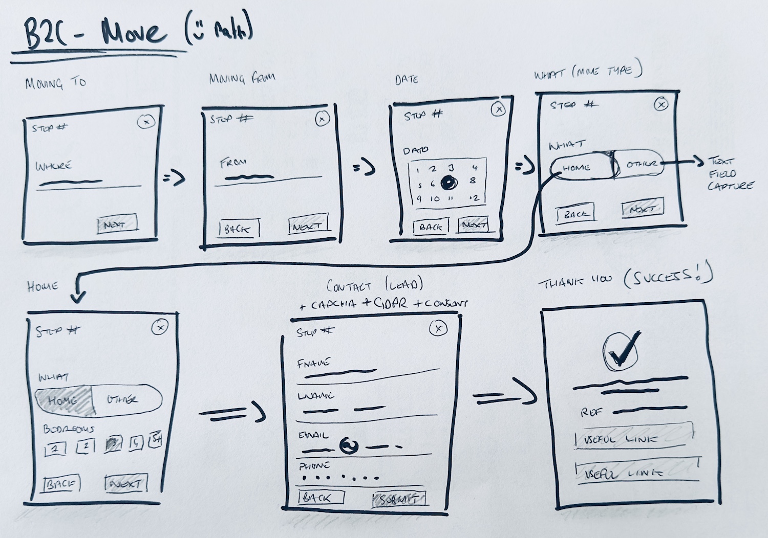
Simplifying Form Requirements
We collaborated with B2B and B2C teams to simplify form requirements to meet both business and user needs. Completion rates jumped from 13% to 52%, and lead quality improved through post-lead communications.

The B2C website was underperforming, missing key revenue opportunities due to friction in navigation and information architecture that drove users away before conversion. The mobile experience was particularly weak, failing to scale appropriately below desktop resolution. High abandonment of quote forms limited qualified leads and increased internal workload, while unclear service offerings made it difficult for users to compare and select options.
The challenge was to redesign the end-to-end experience to reduce friction, clarify offerings, and maximize conversion across all devices.
Working alongside the product director, marketing, SEO, content, and development, my tasks included:
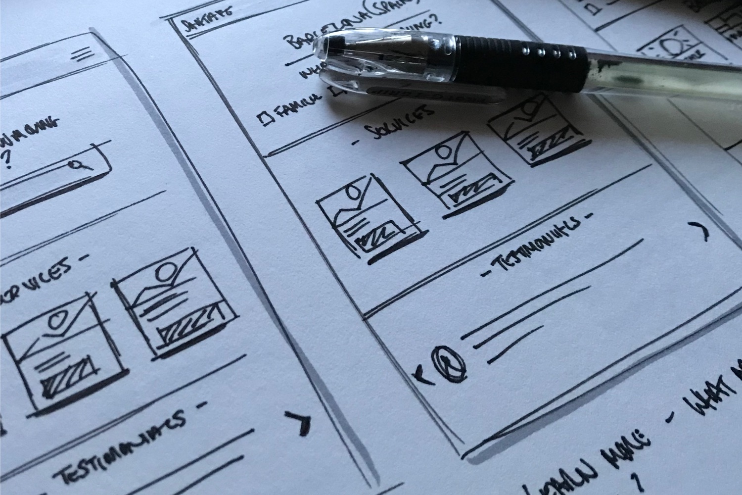
I began by evaluating the AS-IS experience, diving into performance data, and Hotjar recordings to uncover how users were interacting with the site. It quickly became clear that users were getting lost in bloated menus, taking wrong paths, and struggling with dense blocks of text—often leaving the site without ever engaging with services or enquiry forms. These observations highlighted critical friction points that were preventing conversions and informed the priorities for redesign.
To gather further behavioural and qualitative insights, I ran an unmoderated UserZoom study with 8 recent movers (local and international). Test scenarios included:
“There are so many services, it’s overwhelming. I wouldn’t feel comfortable clicking anything without speaking to someone.”
“There’s no way to compare packages. I expected a list but had to go back and forth between pages.”
“What if I want to move something other than a house or flat? Where are the customisation options?”
“There’s too much going on. Too many menu options, and it’s not clear where to go. I don’t have confidence to proceed.”
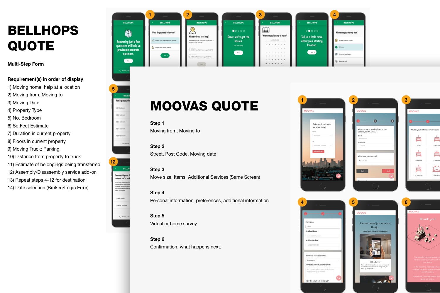
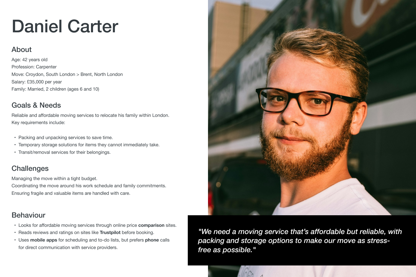
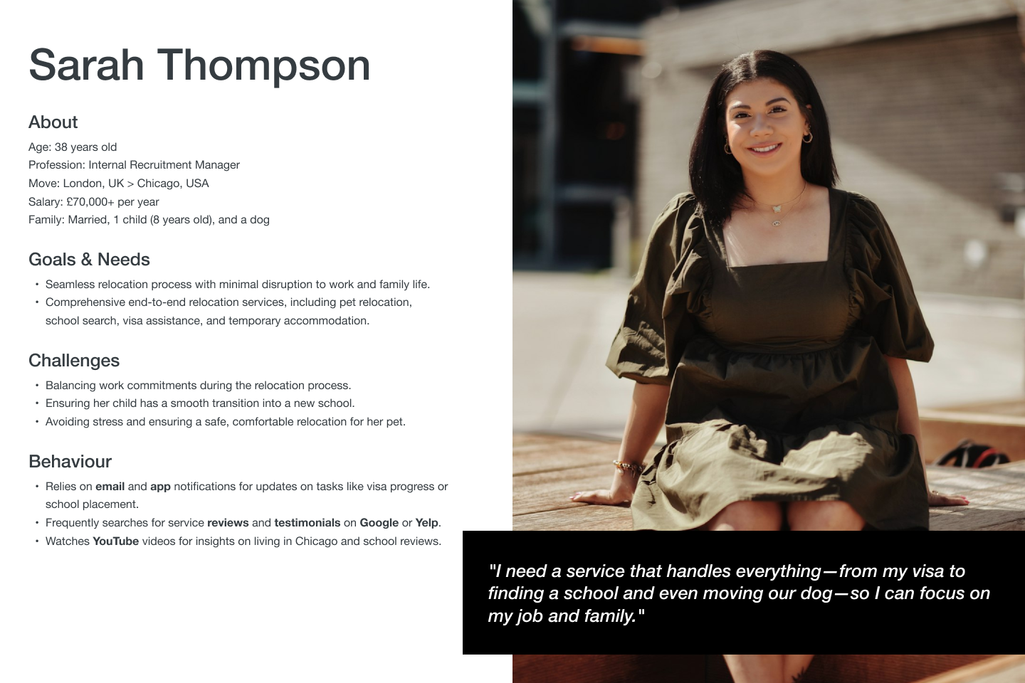
I analysed competitors’ and comparators’ lead generation experiences and developed personas for different customer and manager types. This aligned the team around user needs and behaviours.
We collaborated with B2B and B2C teams to simplify form requirements to meet both business and user needs. Completion rates jumped from 13% to 52%, and lead quality improved through post-lead communications.
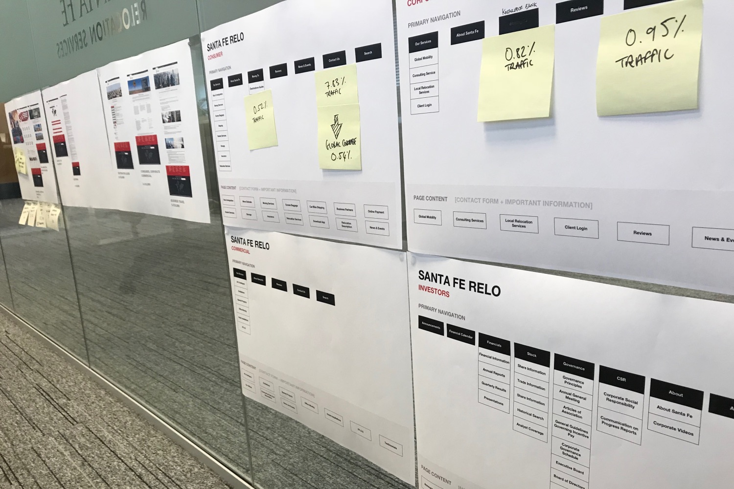
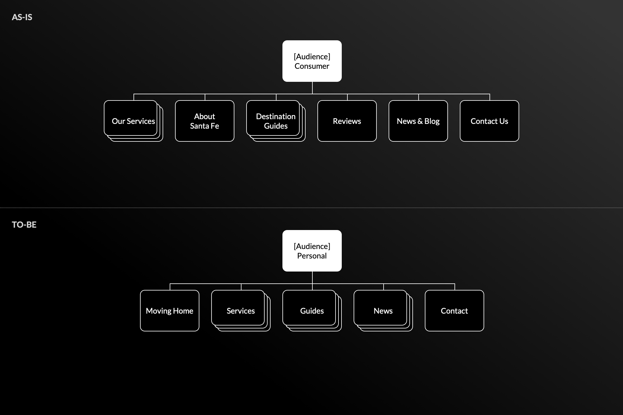
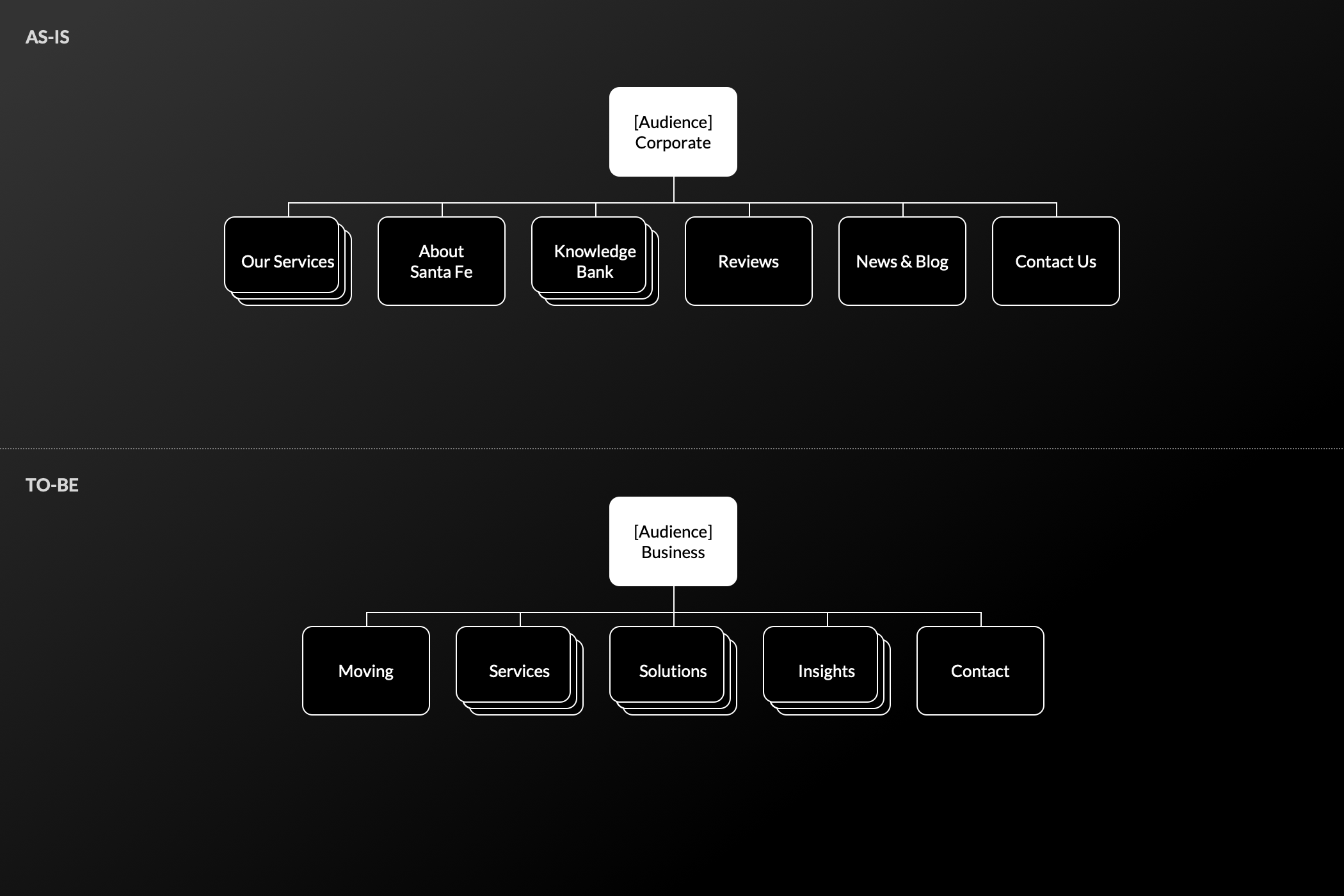
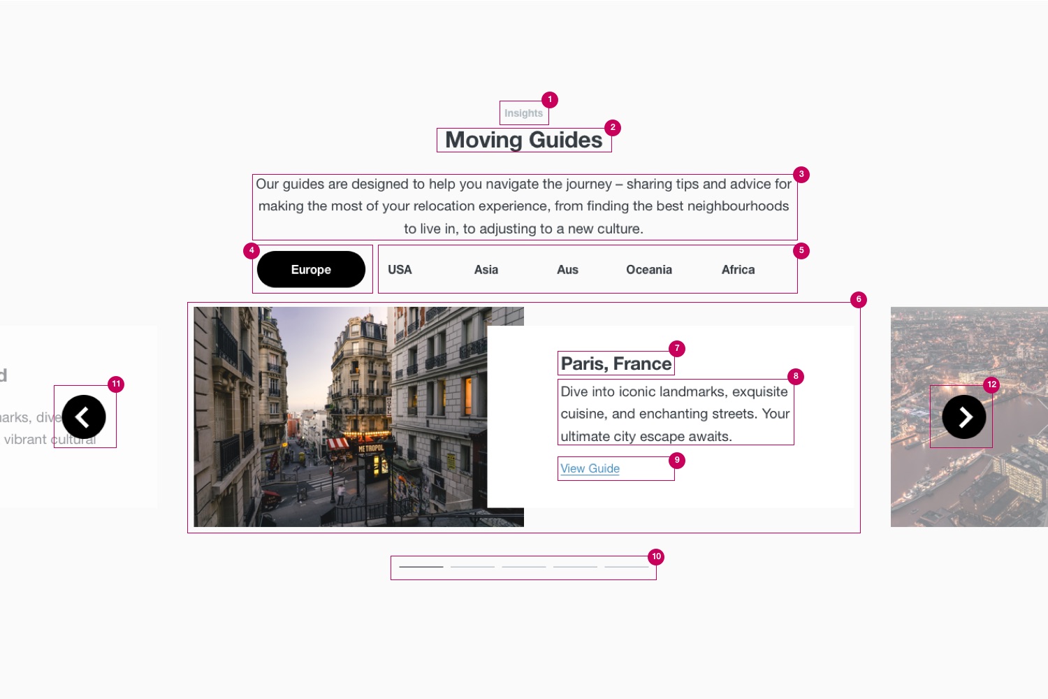
To improve navigation, I collaborated with an SEO specialist to revise labeling and ran a card-sorting exercise with internal stakeholders before validating our approach with 75 participants via tree-testing.
Shown below is a collapsed state revision for both personal and business navigations:
| Scenario | Success Rate | Time to Complete | Directness |
|---|---|---|---|
| Before | 52% | 4m 43s | 56% |
| After | 79% | 2m 58s | 91% |
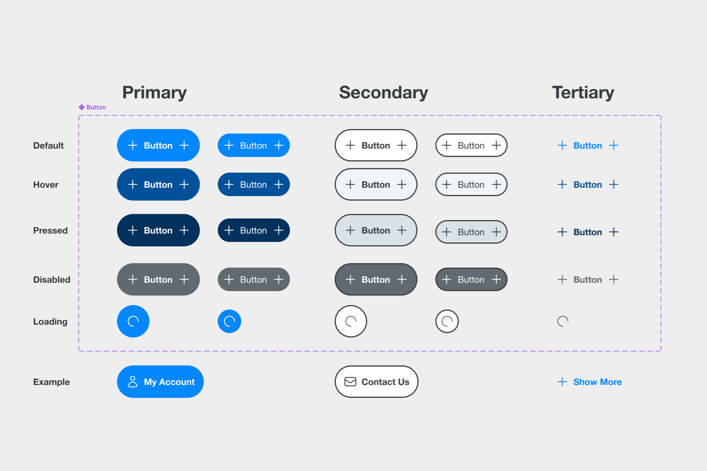
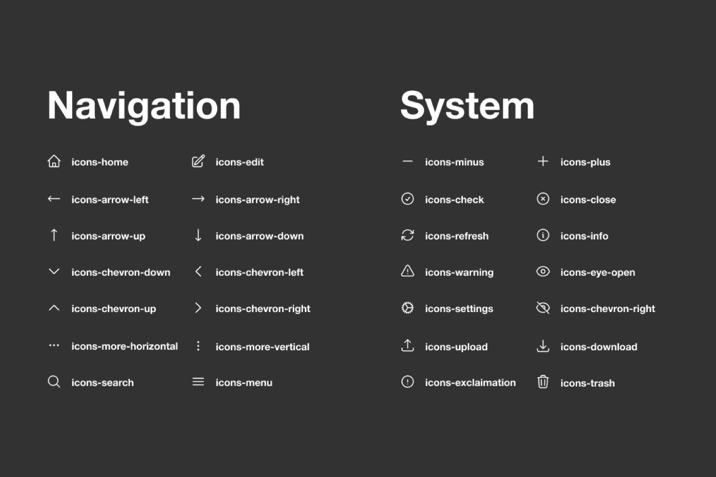
Created a Figma based, atomic design system to improve clarity, and support content flexibility.
Additional deliverables:
Are you passionate about driving value through building compliant, consistent, and accessible digital experiences? If so, get in touch today.