Shipped
Design system, data insights and service optimisation
Client results
39%↑
Increase in lead generation, directly driving revenue growth.
43%↓
Reduction in bounce rate on mobile.
31%↓
Reduction in form completion time.
21%↑
2.3M€ increase in group relocation services revenue.
35%↑
Navigation directness
28↑
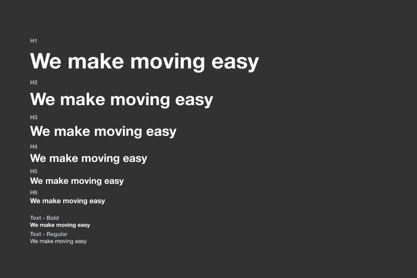
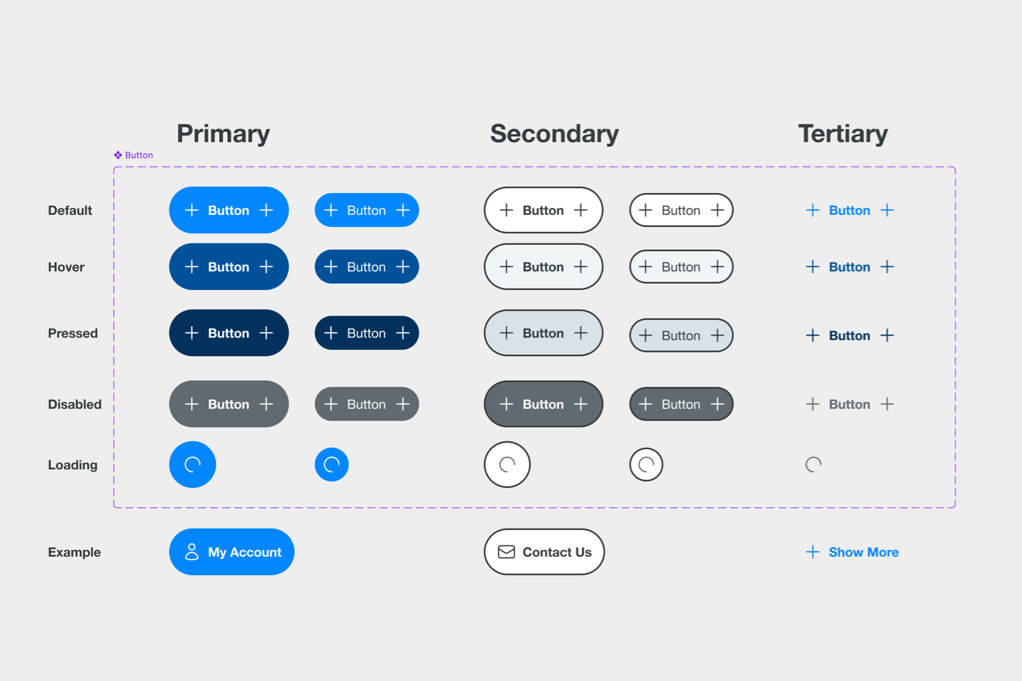
New, and fully responsive components
Background
SFR Group is a global mobility provider, supporting both personal and business relocations with a comprehensive range of end-to-end services. I was engaged as a UX consultant by the Head of Digital to redesign the entire website, optimise user journeys to generate more leads, and identify gaps in the service experience to boost opportunity conversions.
Project in a nutshell
Problem
Solution
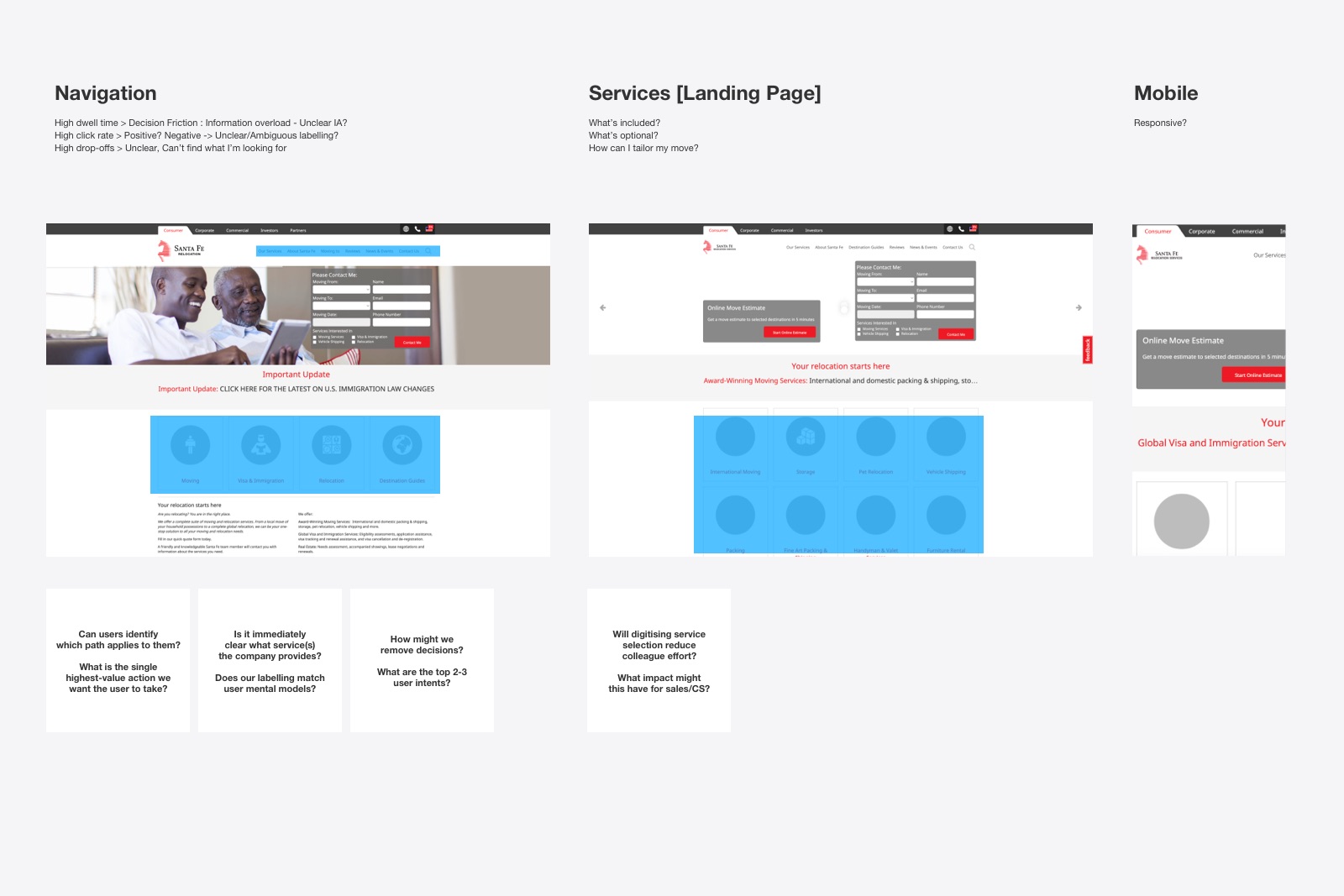
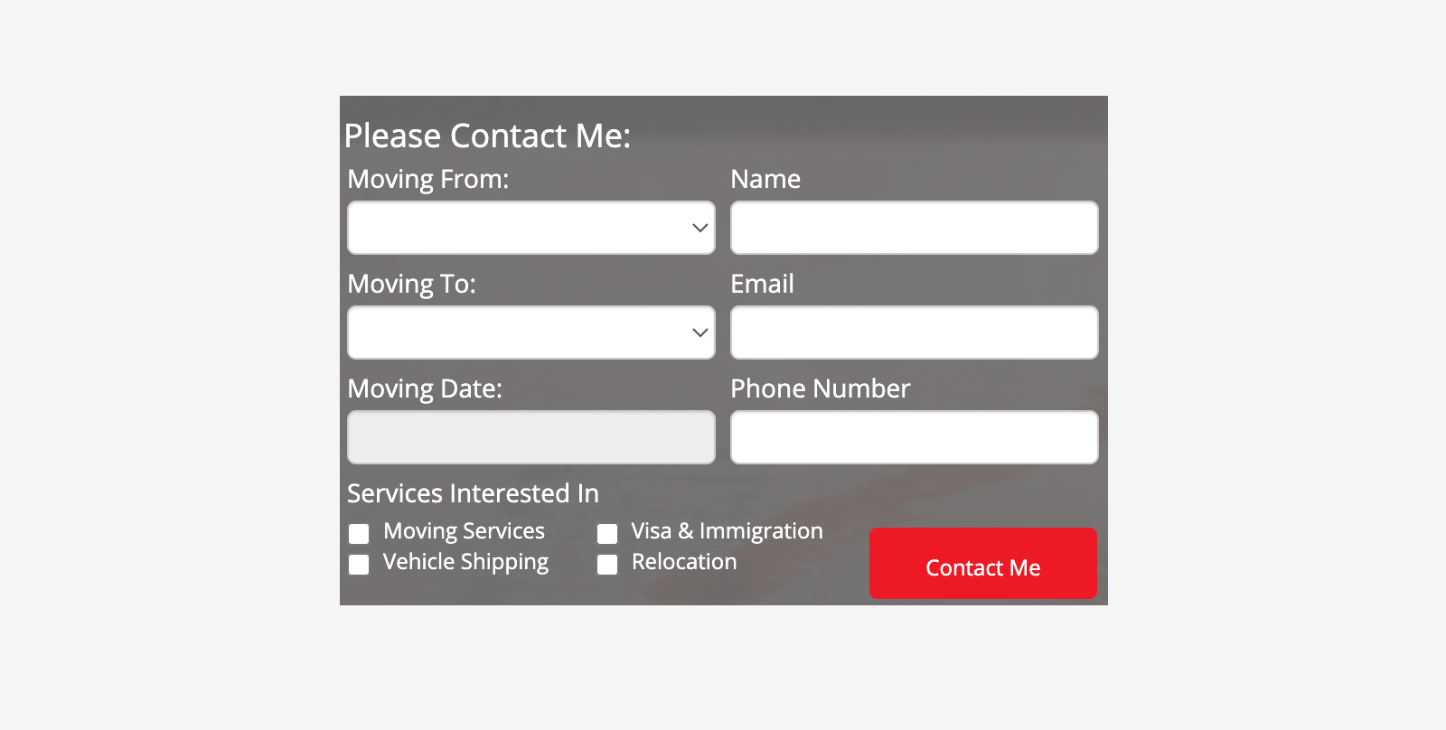
Outdated & inconsistent UI
Users were required to decipher multiple visual languages, increasing cognitive load and reducing pattern recognition across the experience.
Modern and intuitive design system
A unified design system introduced visual consistency, strengthened message hierarchy, and improved overall usability.
High call-centre effort
Key services were hidden or incompletely listed, leaving users uncertain and prompting unnecessary support calls.
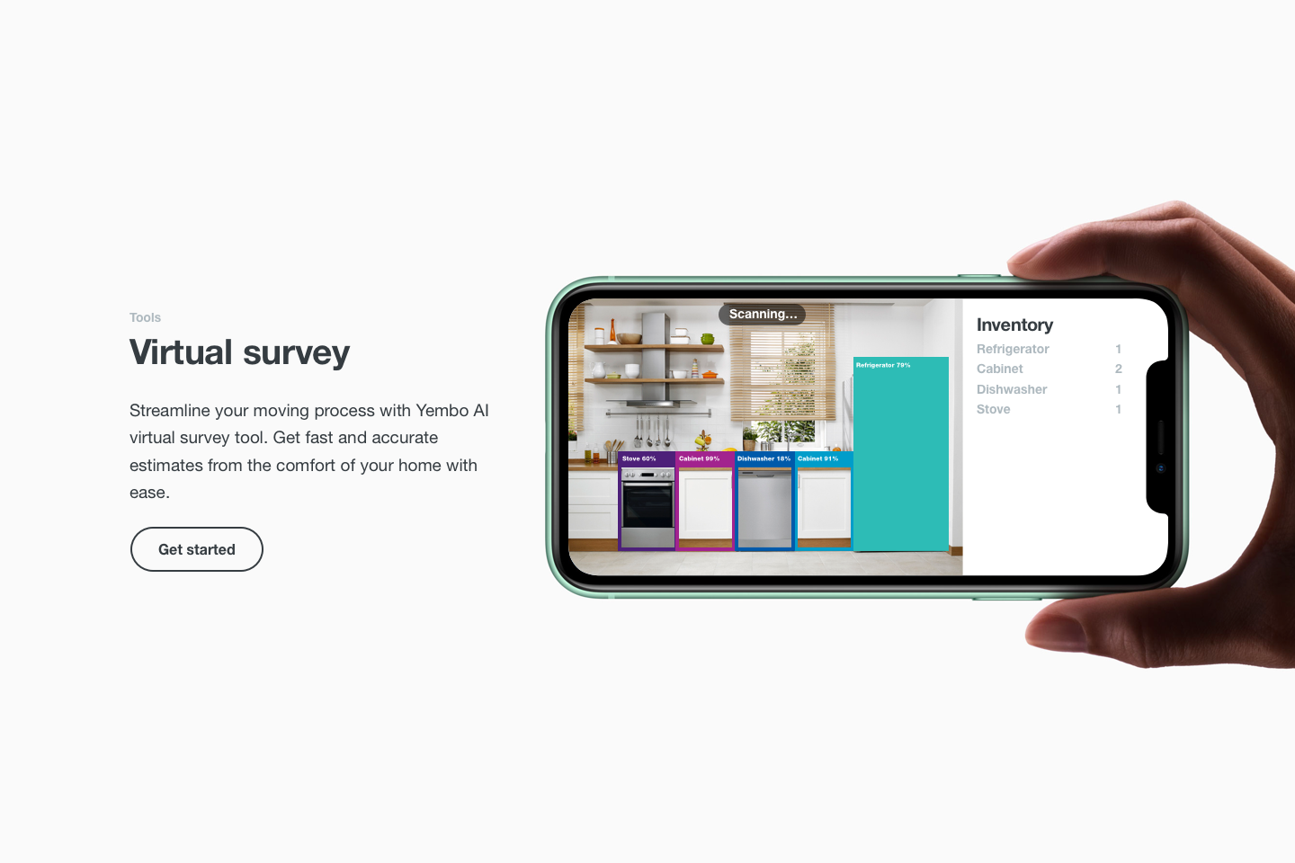
“What’s Included” service tables
Introduced structured comparison tables on primary landing pages to help users easily understand package inclusions and make confident decisions.
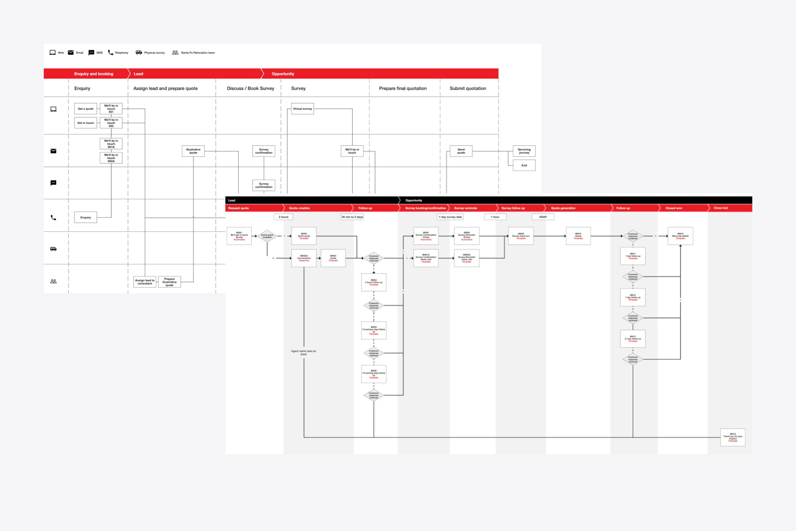
Service design gaps
Periods of silence in the experience led to missed communication opportunities and reduced user confidence.
End-to-end experience mapping
Mapped the full journey to identify communication gaps, enabling targeted improvements that reduced sales and call-centre dependency.
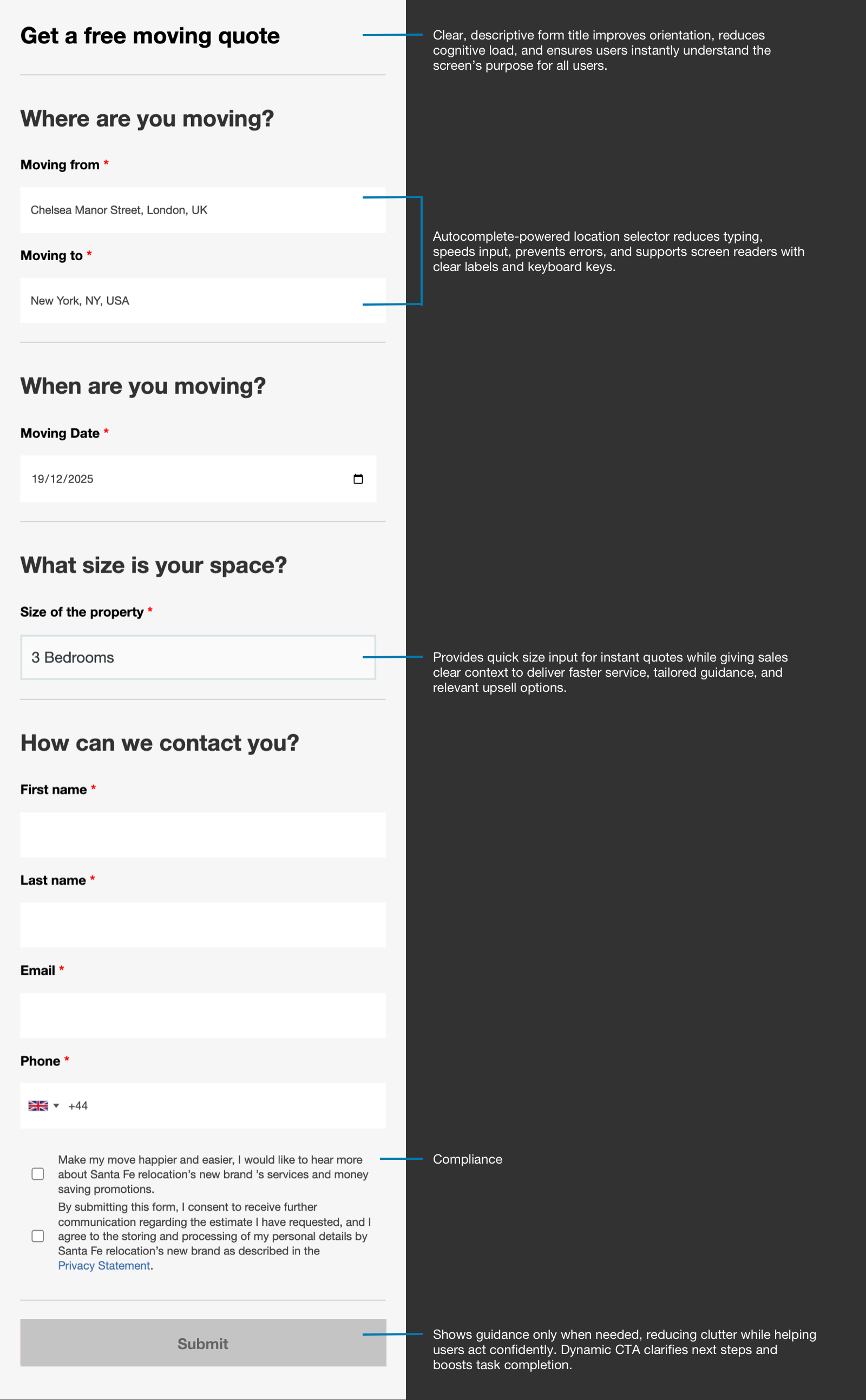
Form abandonment
Ambiguous requirements and missing helper or error messaging created uncertainty and prevented successful completion.
Form optimisation & testing
Streamlined fields, introduced clear guidance and validation patterns, and validated changes through usability testing.
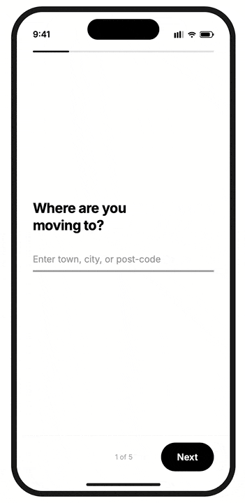
Mobile design
The experience did not scale below tablet resolutions, creating usability issues for mobile users.
Responsive design system
Developed a fully responsive component system and mobile-first layout patterns to ensure seamless interaction across all device sizes.
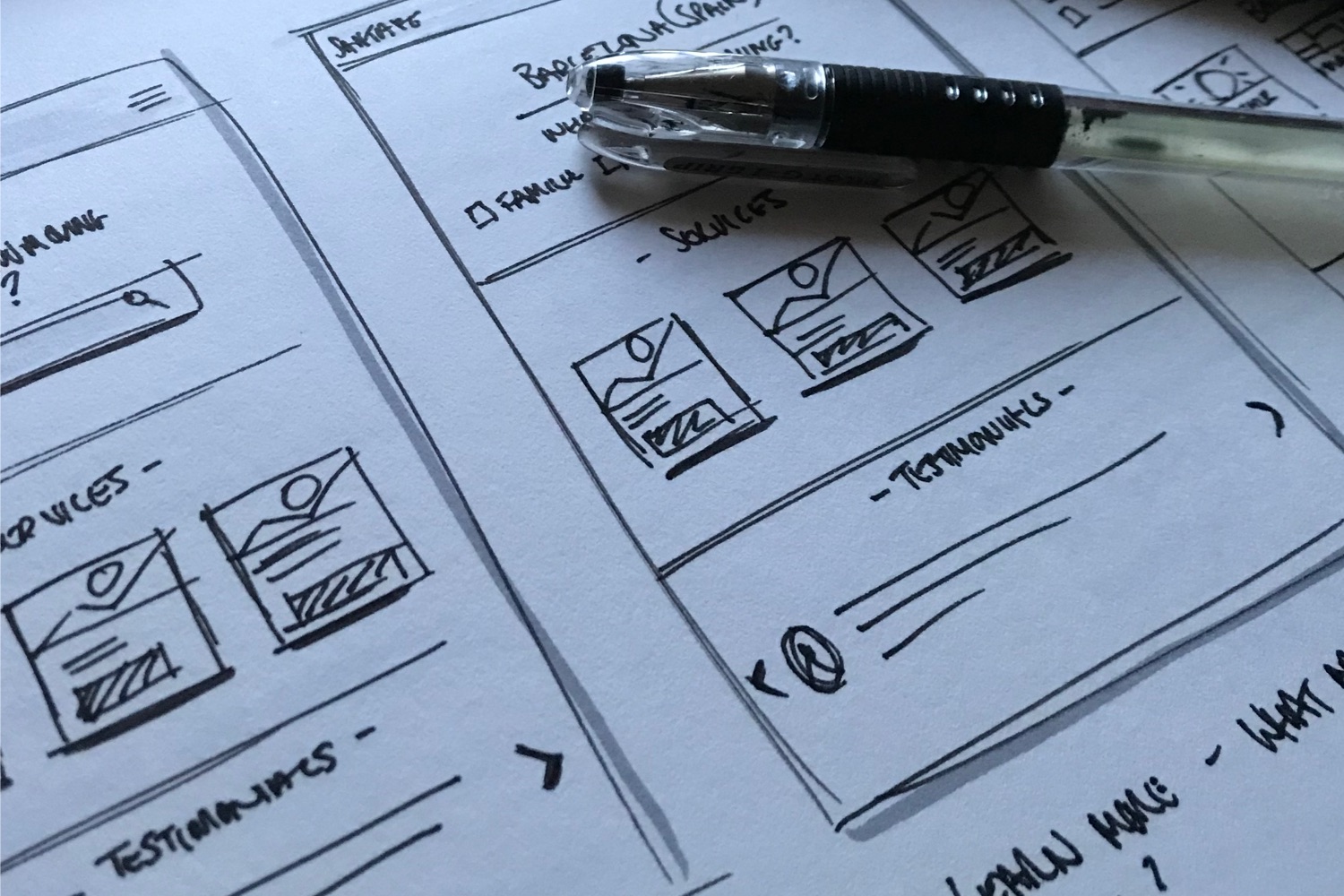
Research & Insights
As part of the discovery phase, I conducted a comprehensive heuristic review and analytics audit to understand how the current website performs and where users experience friction. Bringing these insights together allowed me to pinpoint the most critical usability issues, validate them with data, and highlight a series of high-impact quick wins that would guide the redesign direction.
User testing: AS-IS
To deepen understanding of friction and gather sentiment data for the existing site journeys, we ran an unmoderated, think aloud study with tasks around the following themes:
- Value Proposition: Stimulus: Homepage
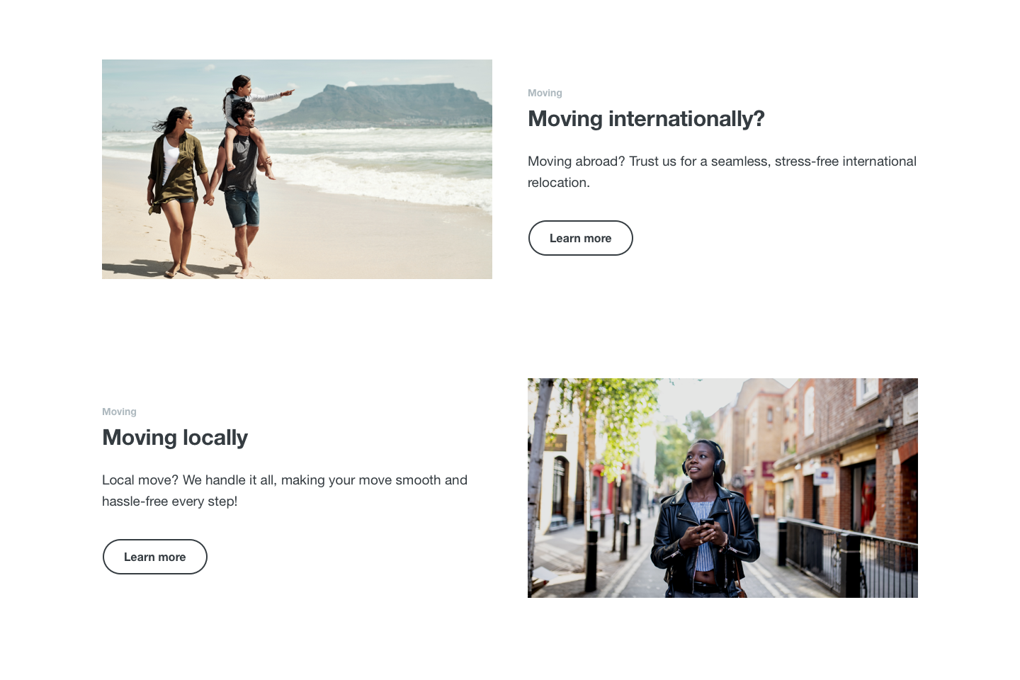
- Core Journey: Moving International or Locally [Efficiency / Path]
- Transparent Pricing & Services: Stimulus: Moving International or Locally
- Engage: Stimulus: Moving Form [Efficiency / Effectiveness / Path / Time]
"
“There are so many services, it’s overwhelming. I wouldn’t feel comfortable clicking anything without speaking to someone.
"
“There’s no way to compare packages. I expected a list but had to go back and forth between pages.
"
“What if I want to move something other than a house or flat? Where are the customisation options?
"
“There’s too much going on. Too many menu options, and it’s not clear where to go. I don’t have confidence to proceed.
"
“It's not clear if this is for people, business, or both, and what if I'm moving something else?
"
“I would just call somebody. It's easier to explain what I want.
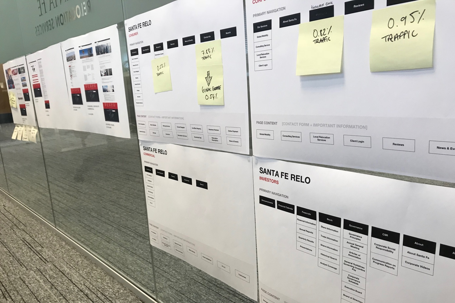
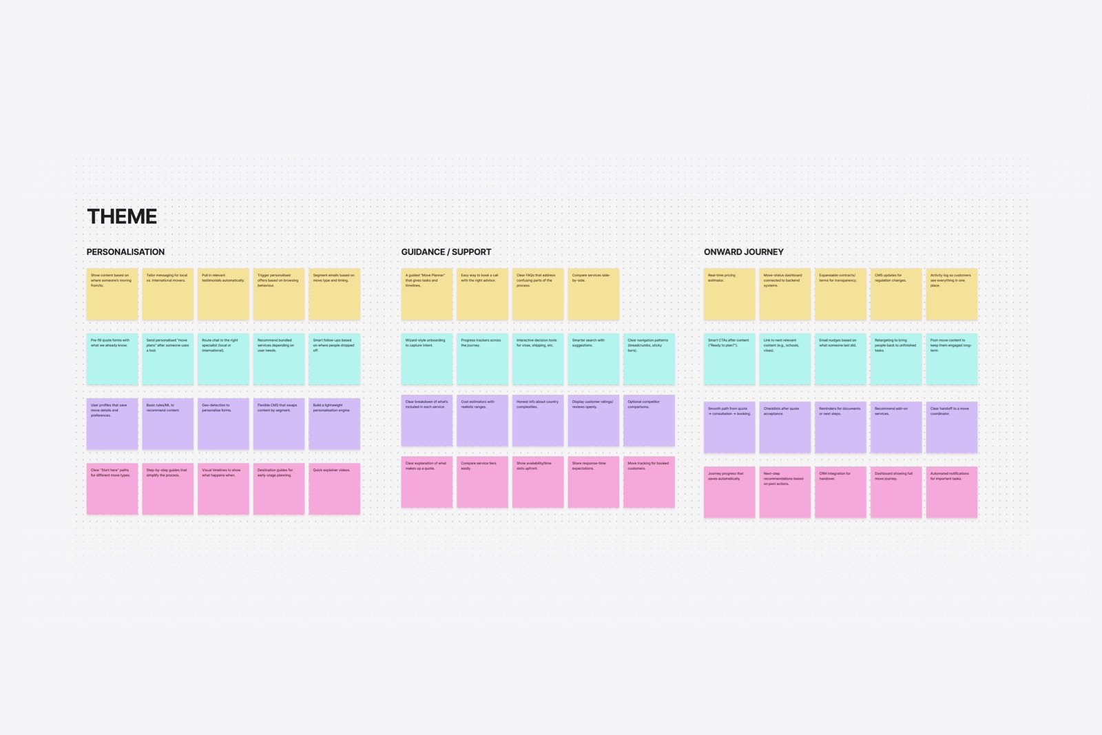
Experience mapping & Prioritisation
With a clear set of user and business problems surfaced through research, collaborative workshops, and service/journey mapping, the team used an effort–impact matrix to determine where the project budget would deliver the greatest value. We identified the following areas:
Efficiency
Lead generation and contact forms
SEO
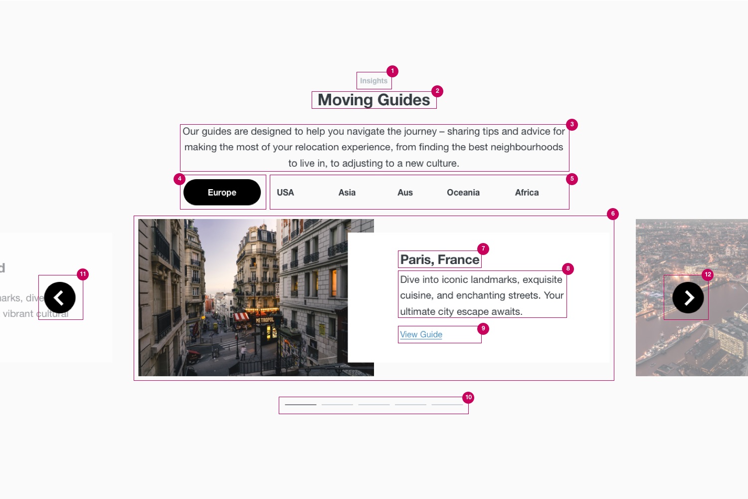
Moving guides for country and cities
Transparency
Service options and pricing
Conversion
Post-lead communications
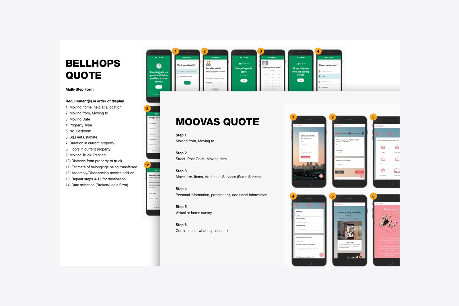
Benchmarking & Persona Development
Competitor and market analysis provided essential context, highlighting industry standards and identifying opportunities to differentiate. I mapped onboarding flows, landing page, navigation labels, CTAs, form requirements, and post-lead comms against several brands ranging from premium services to small-budget moves.
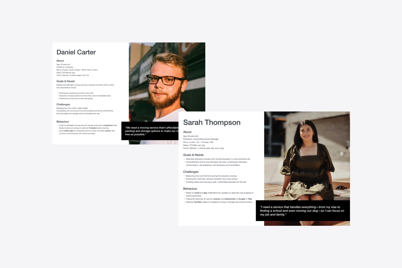
Alongside marketing and sales, we generated a series of personas to match different user-types and help ensure our proposals answerered needs and wants.
Putting it all together

WHAT I LEARNED
One of the most valuable takeaways from this project was gaining a truly end-to-end view of shaping an omni-channel experience, and having the opportunity to lead the design process through every phase. It’s rare for designers to have full visibility and ownership across such a broad ecosystem, and I’m genuinely appreciative of that level of trust and exposure.
Being able to see the system several steps ahead fundamentally influences how you design. It sharpens your instincts around structure, alignment, and downstream impact. You start making decisions not just for the immediate deliverable, but for how information, interactions, and intent will flow across the entire experience. That forward-looking lens ensures that whatever we define lands in the right format, with the right fidelity, and in a way that sets the broader product and team up for success. .