Fast-forwarding media steaming app personalisation
Challenge
As part of a POC, this project was spread over six two-week sprints, with a target to design and run user testing for three separate opportunities to increase app user engagement
1 | Personalisation:
A curated channel/playlist based on user interests
(This case-study)
2 | Support:
Personal timeline to resolve issue with technician chat
3 | Sharing:
Content with non-subsribers to encourage signup
Role
The project team embedded itself into the Sky Italia offices in Milan to collaborate closely with stakeholders. I was responsible for ideation, scamping, wireframes, prototyping, test setup/reporting, and delivery of design documentation.
Research & Insights
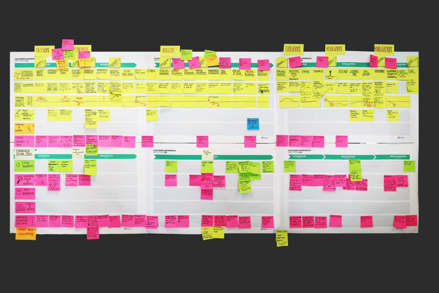
As part of an initial discovery phase, the team worked on mapping the experience, as below, and leveraging existing business insights to form ideas for testing.
Experience mapping
Existing app experience: Qualitative feedback
“Even though I searched for shows I like, the results don't seem to match what I’m in the mood for. I spend more time looking for something to watch then actually watching."
"I'm scrolling forever to find something that fits. It would be nice if the system could understand my taste and recommend shows without me having to search for them each time."
"OK, search - great, it's the same everywhere. I’d expect it to offer smarter suggestions based on what I’ve watched or what I’m interested in, instead of just listing everything."
There was a clear pattern and message forming: users felt the application lacked meaningful personalisation. Content discovery, when left to search and system learning, increased user effort and frustration — a sentiment that many can attest to.
Here's what we learned:
- Too many options create decision fatigue and endless scrolling.
- Recommendations feel repetitive or off-target.
- Niche or new content gets buried under popular titles.
- Shared accounts distort personal recommendations.
- “Because you watched…” logic overfits on one-off views.
- Recommendation rules feel opaque and untrustworthy.
- Users lack control to refine or reset suggestions.
- Trends are prioritised over long-term taste patterns.
Hypothesis
- We believe that allowing users to create their own thematic channels (e.g., “My Sci-Fi” or “My Channel”) will increase session length and sense of ownership.
- We believe that enabling users to co-curate playlists with friends or family (e.g., “Movie Night” or “Kids’ Favorites”) will boost engagement across shared accounts.
- We believe that introducing mood- or context-based channels (e.g., “Background While Cooking,” “Weekend Binge”) will help users discover relevant content faster and extend viewing time.
- We believe that providing tools to refresh or reset stale playlists (e.g., “Surprise Me” mode, replace 50% of items) will prevent fatigue and keep curated channels engaging.
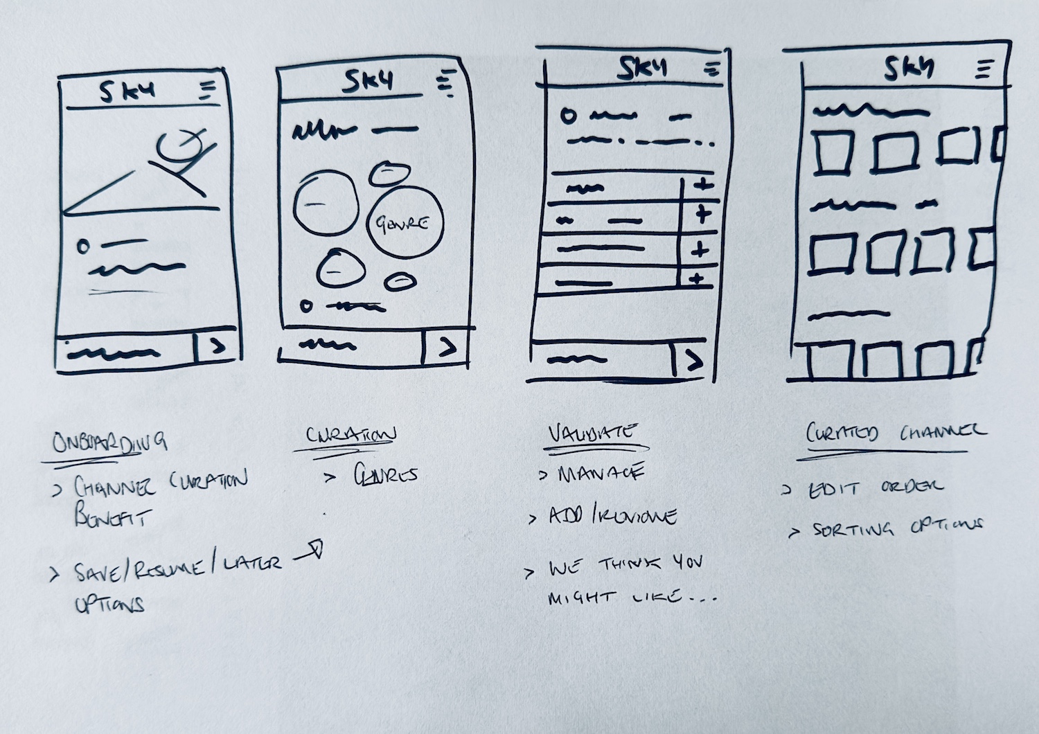
Design
Following competitor research, we uncovered two patterns that we wanted to base our design on and that we would take into user testing:
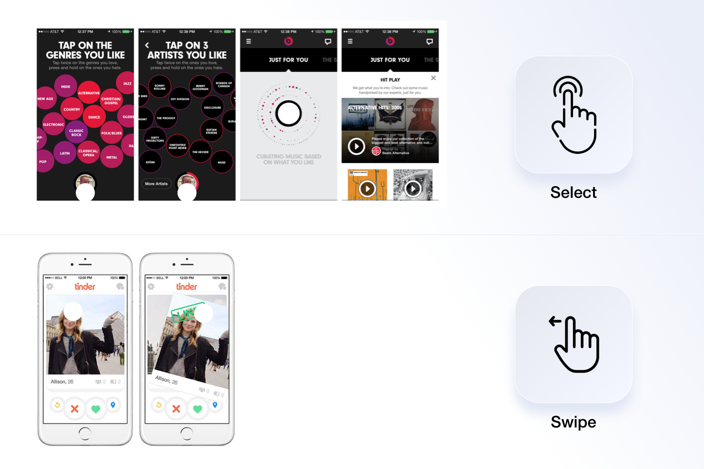
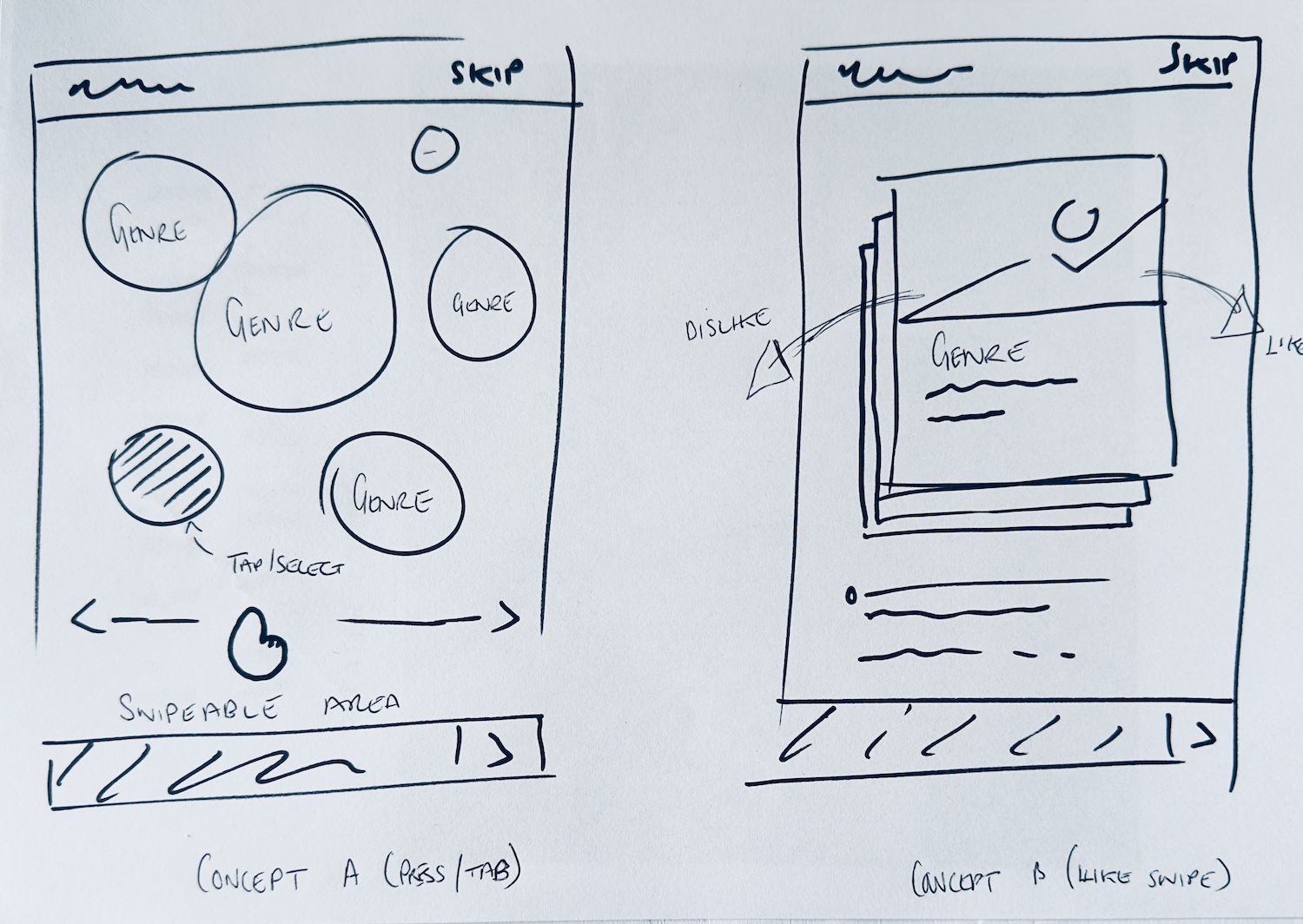
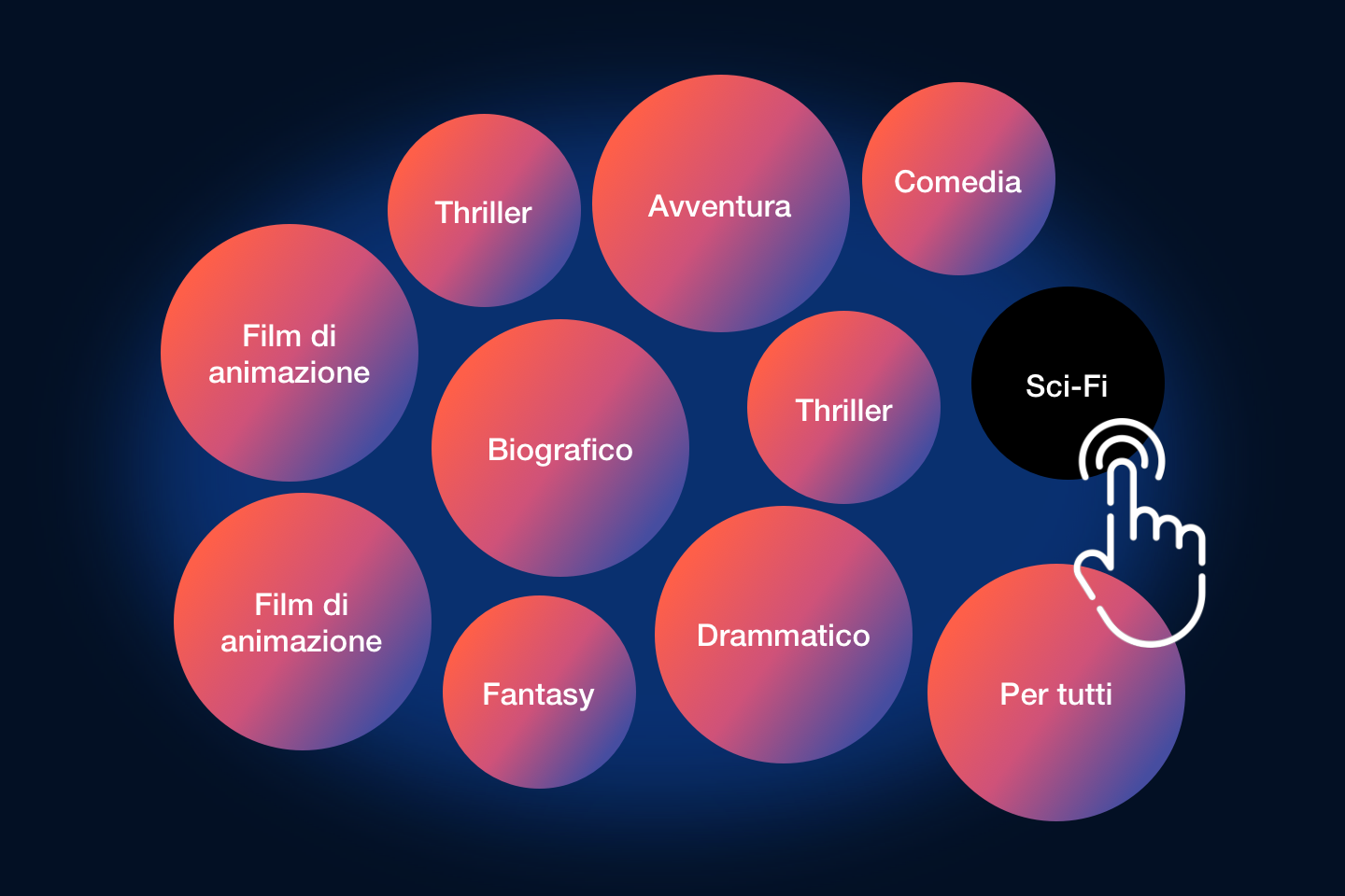
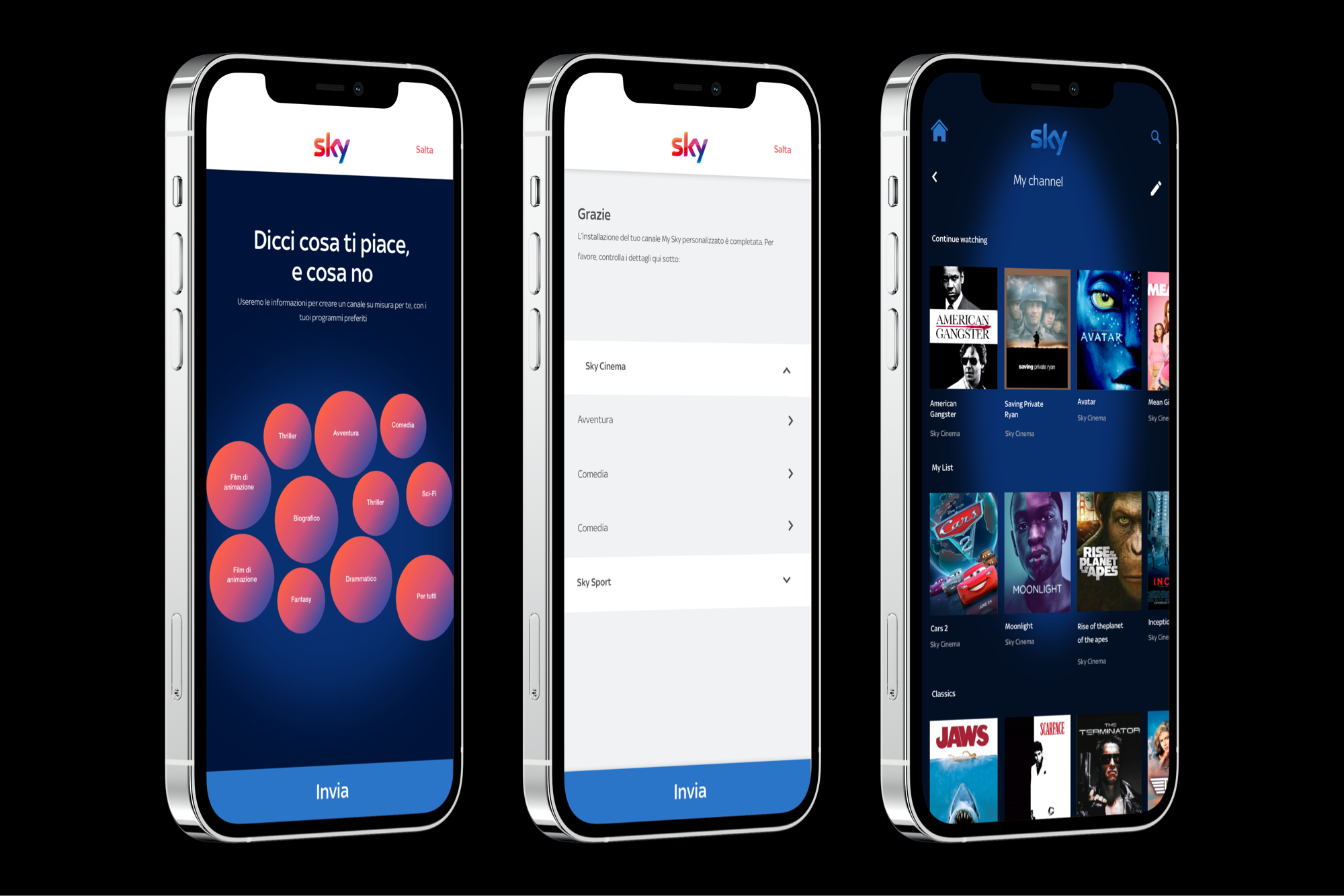
A: Tap to select
As per the Dre Music example, we built a prototype that presented a range of selectable categories in a horizontally scrollable area. As the user selected content of interest, the system would store the data for verfiication, and also display related content dynamically to expedite the process.
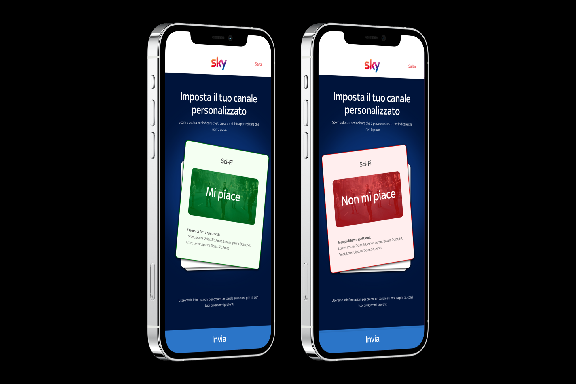
B: Swipe to like
We also liked the idea of using Tinder swipe behaviour. The pattern is extremely efficient and intuitive, customers simply swipe left or right based on whether they liked or disliked a category or genre of content. In the background, the app would learn and again display related content.
Outcomes
- Users found the swipe pattern easier to use, but spent longer and provided more data using the tap to select method.
- 6/8 users told us that they would prefer to provide data upfront if it increased the accurancy of suggested content.
- 8/8 users told us that they would continue to manage preference to improve suggested content
- Users spent an average of 03:41s on personalising their experience. This was a strong indicator of appetite.
- 6/8 liked having a seperate listing screen vs. combined total listing with a single row dedicate to personalised content.
Let's Talk
Are you passionate about driving value through building compliant, consistent, and accessible digital experiences? If so, get in touch today.
Send a messageLinkedin