Shipped
Data-driven redesign of a high-traffic ecommerce homepage

Client results
641%↑
Increase in individual hero banner CTR, directly expediting journeys.
5062.79%↑
Increase in overall hero banner engagement.
684.6↑
Increase of clicks on the in-page navigation leading to higher exposure.
305%↑
Increase in section clicks.
183.2%↑
Increase in newsletter sign-up clicks.
1
High engagement, accessible, and versatile component rolled out across regions.
Background
The client’s B2C homepage was struggling to deliver both engagement and value. Despite strong brand equity and a broad product ecosystem, users struggled to understand what the homepage offered or where to begin. Key content areas competed for attention, campaigns lacked clear hierarchy, and users often bypassed the homepage entirely. The challenge was to rebuild the structure so users could confidently navigate, discover, and explore.
Project in a nutshell
Problem
Solution
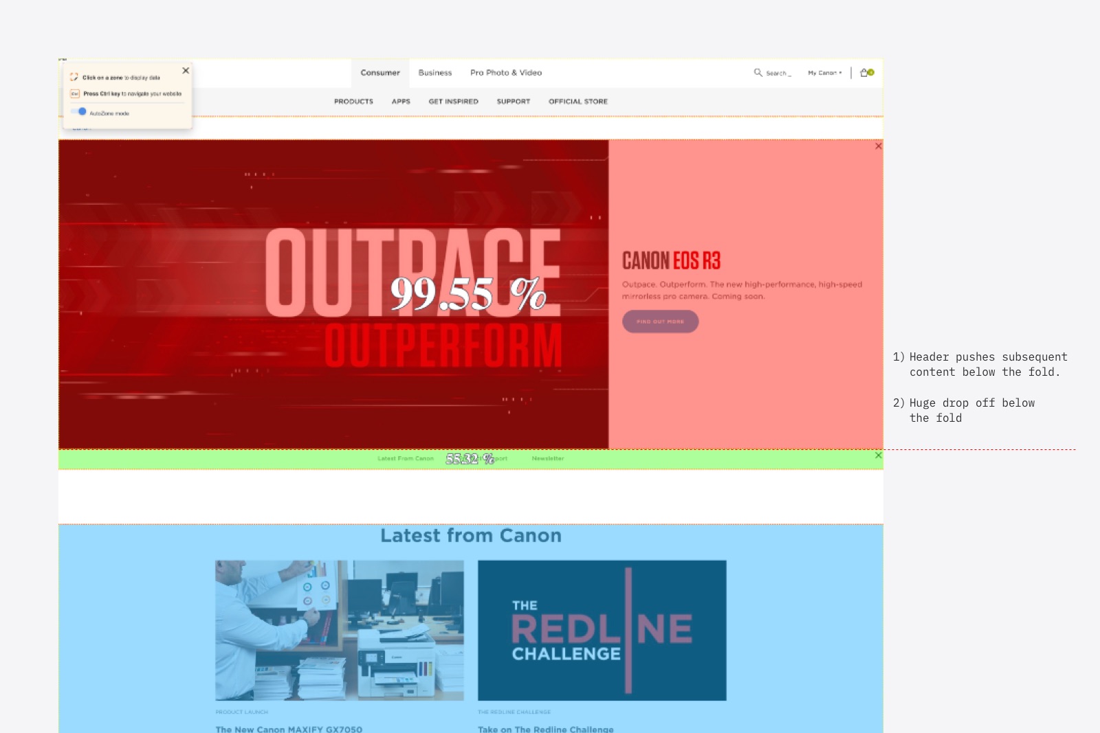
Low scroll rate
Just 11.23% scrolled beyond the existing hero header. Data showed that on the top five resolutions by traffic, subsequent content appeared below the fold.
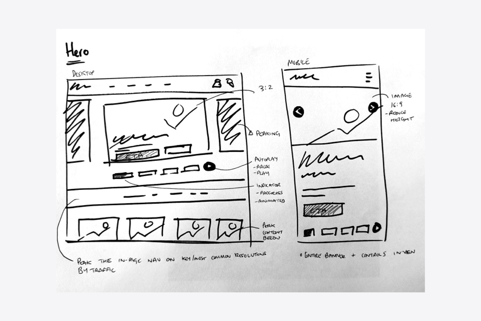
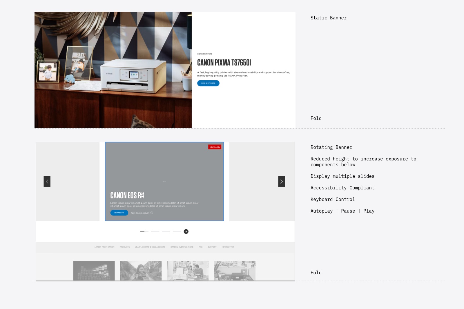
Reduce the size of the banner
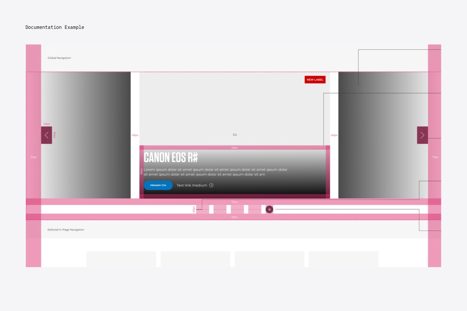
Simply reducing the banner to 70% it's current height would display more content.
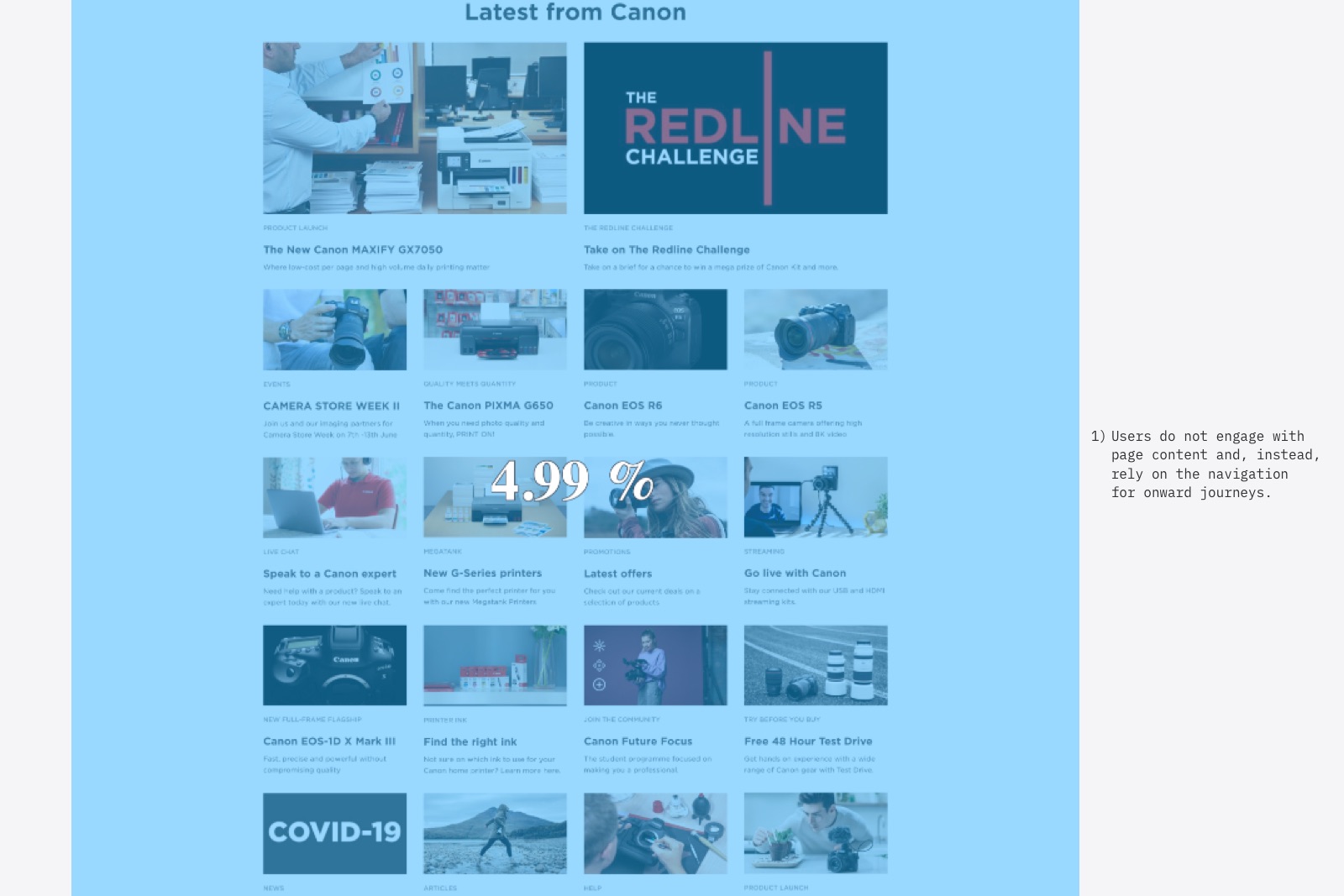
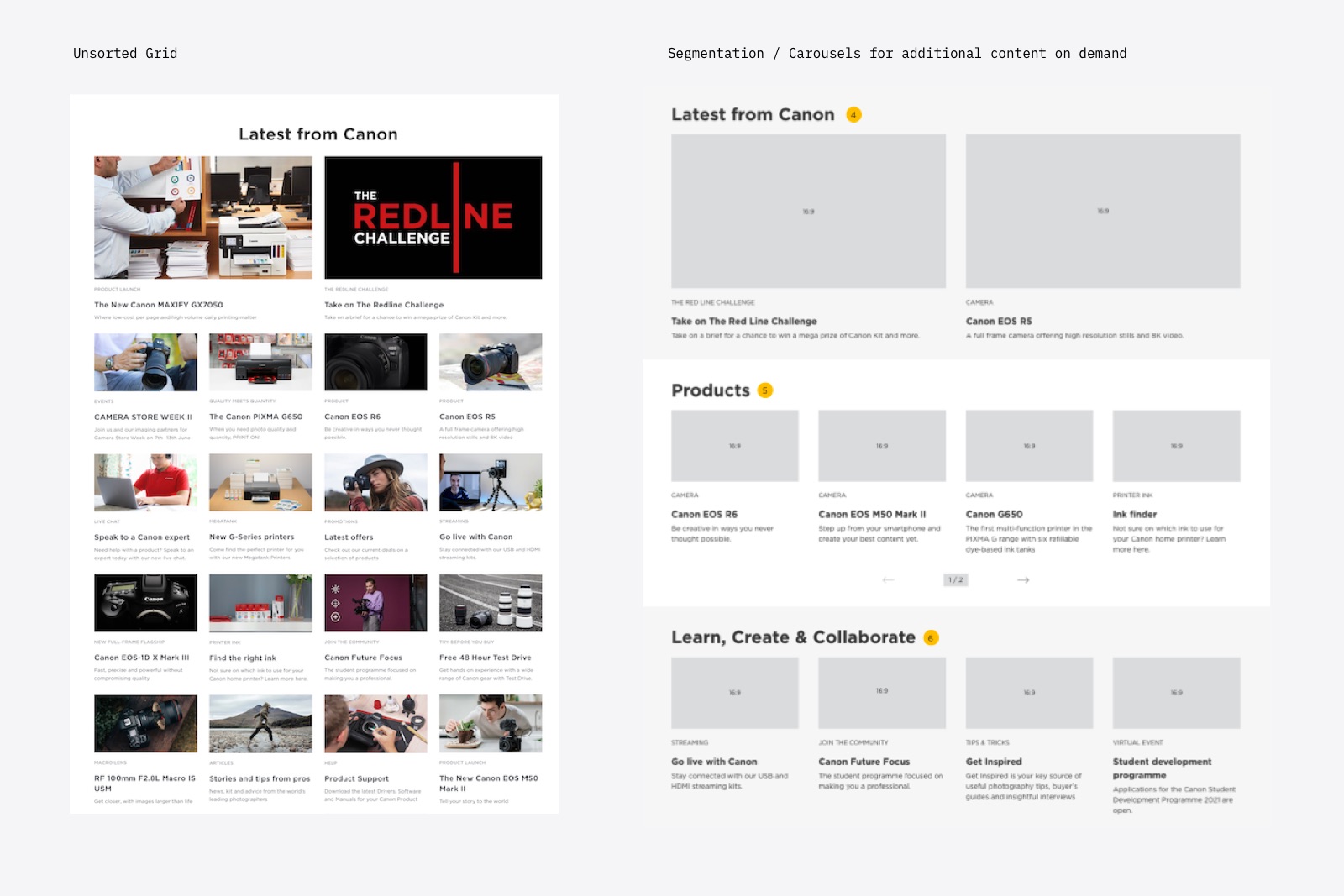
Low engagement on 'Latest' grid
Just 12.98% were spread across many links demonstrating users felt overwhelmed, or couldn't find relevant content quickly and easily.
Section content using headings
Creating a hierarchy of content would allow the user to scroll the content and making faster decisions.
Static hero banner
Stakeholders were rightly concerned that the static banner increased discovery effort.
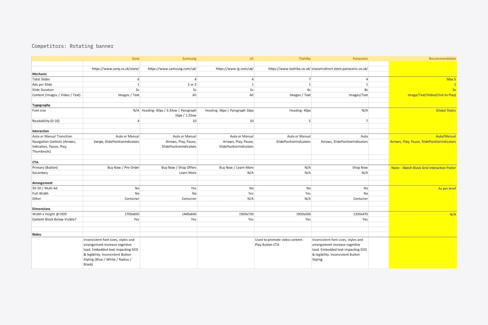
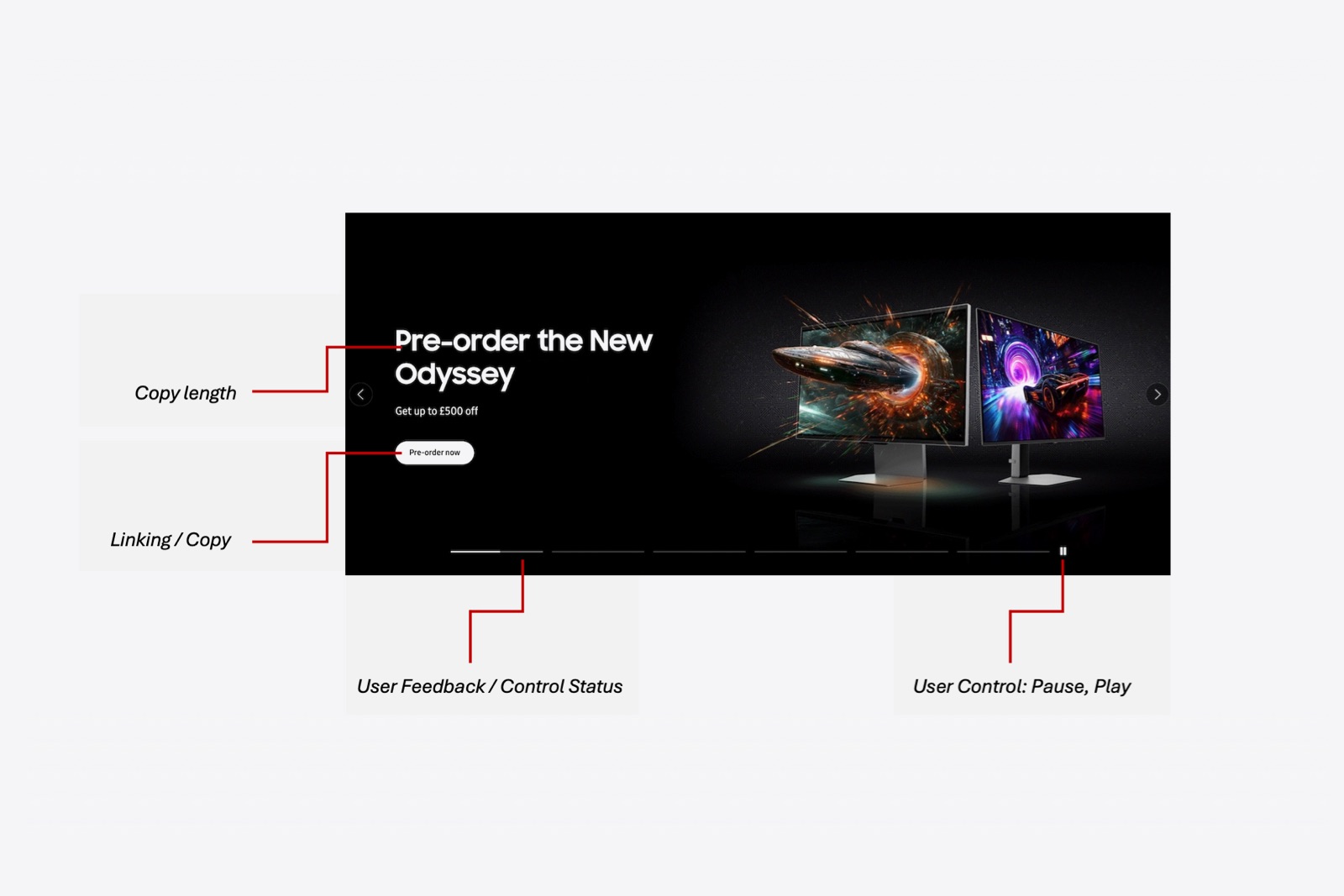
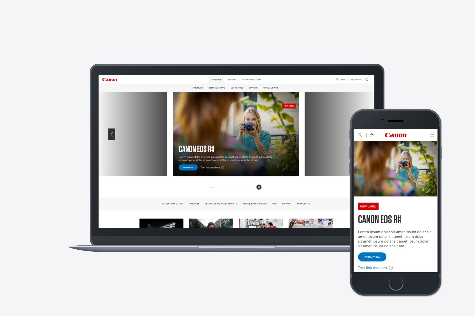
Rotating banner
The business would have more opportunity to showcase their latest content, and the rotating banner would be more visually appealing.
Research & Insights
The research methodology comprised two main phases: Phase 1 involved conducting a heuristic analysis and gathering heatmaps data to inform subsequent proposals, while Phase 2 focused on a detailed benchmarking of competitors, specifically:
- Content hierarchy and page length optimisation
- Strategies for driving engagement through interactivity
- Navigation structure and its relationship to page content
FINDINGS
With a large stakeholder group across marketing, sales, brand, and product, it was vital that any proposal aligned with real evidence. At a high-level, we found the following trends amongst competitors:
- Tabs and filters: Surface relevant content. [Out of scope due to development cost]
- Sectioned content: Product, campaigns, and support were displayed separately.
- Product recommendation tools: Help surface relevant products based on needs.
- 6/7 Included a banner or link to support.
- 4/7 Included a banner or link to product registration.
- 3/7 Included expert reviews, stories, or tips and tricks.
- 5/7 Included a rotational banner to highlight products and campaigns.
Ideation workshop
To determine the homepage hierarchy, we ran a focused stakeholder workshop designed to align user needs with business priorities. Through a series of fast, collaborative exercises including business goal ranking and a guided priority-matrix activity, we surfaced what users value most, what the business needs to promote, and how each content area should be positioned. By combining these inputs, the group reached a shared, evidence-based hierarchy for the new homepage, creating a clear foundation for design while ensuring cross-departmental buy-in.
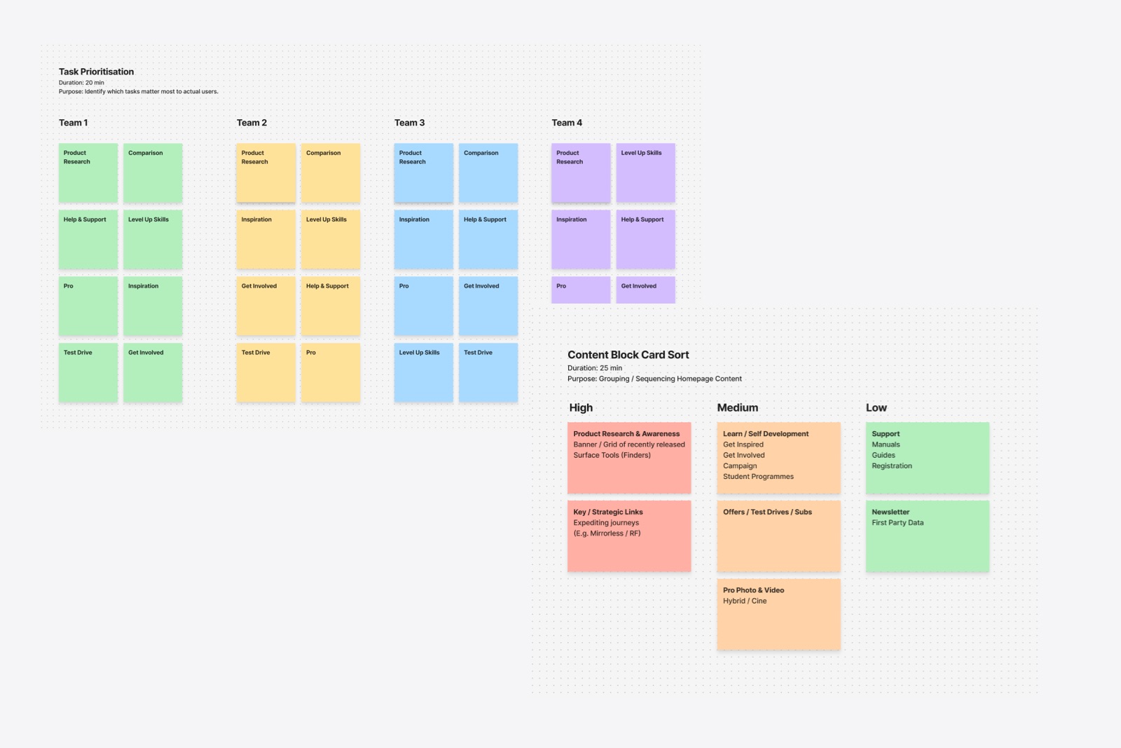
High
Latest products and campaigns, quick links to key strategic categories, brand campaigns
Medium
Learning & Development, Offers, Pro Photo
Low
Support, Newsletter
Nice to have
Subs and services
Putting it all together
WHAT I LEARNED
The key learning was that alignment doesn’t come from trying to please everyone equally, but from creating a shared decision-making framework grounded in user intent and business impact. By facilitating structured exercises, mapping objectives transparently, and making trade-offs explicit, I was able to turn disparate requirements into a cohesive hierarchy that everyone could stand behind.