Increasing engagement through data-led design

Challenge
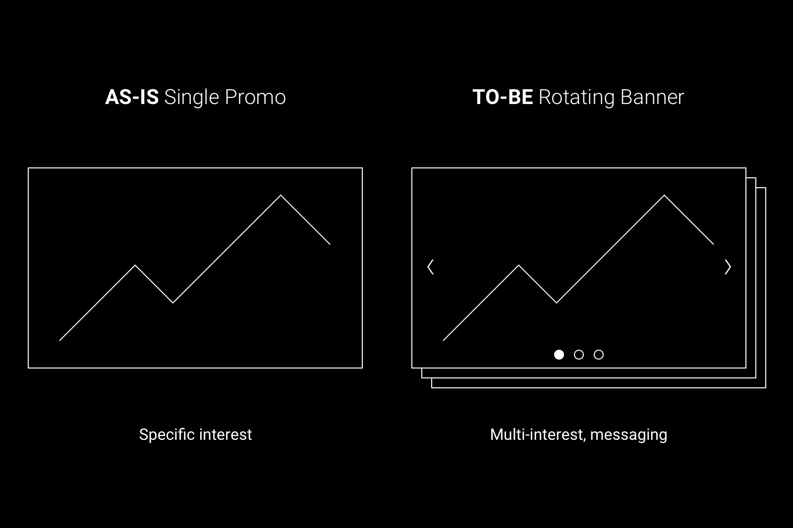
In response to a performance report highlighting low click-through rates, poor exposure, and short session durations on the homepage, the company decided to refresh the design. A key requirement from the Product Director and marketing teams was to introduce a rotating banner above the fold to showcase multiple promotions and campaigns to boost user engagement.
Role
Working alongside the product director, marketing, content and development, my tasks included:
- Gathering and documenting business requirements.
- Conducting competitor and comparator research.
- Proposing and validating design solutions through user testing.
- Documenting designs for development scoping and build.
- Managing implementation through reviews and QA.
- Defining component and template rules for the design system.
Research & Insights
My research was divided into two phases: first, to identify usability issues with the existing component using heatmaps; and second, to analyse how competitors design and use rotating components to drive customer engagement.
Usability Issues:
- Just 11.23% of traffic scrolled beyond the existing banner component positioned beneath the main navigation.
- Banner images were not clickable and lacked ALT text, reducing accessibility and interactivity.
- Clicks from content, excluding the navigation, was only 12.98%.
- Excessive copy further increased the component's height, compounding layout and usability issues.
Competitor Analysis
To make sure the solution aligned with best practices and familiar interaction patterns, I carried out competitor research. The goal was to understand how others approached common design and usability choices and to identify what worked well for users.
Research Goals
- How long should a slide be display for?
- How many slides is too many?
- What controls are required?
- What is the optimal copy length in relation to slide duration?
- How can we ensure CTAs are clear?
- How can we make the banner accessibility compliant?
- How will the banner work on smaller resolutions?
- How do we handle different media types?
We determined that the optimal slider transition duration was 5-7 seconds. Given the proposed content, we chose 5 seconds but ensured this was a customisable field within the CMS when briefing development, allowing us to optimise the experience as needed.
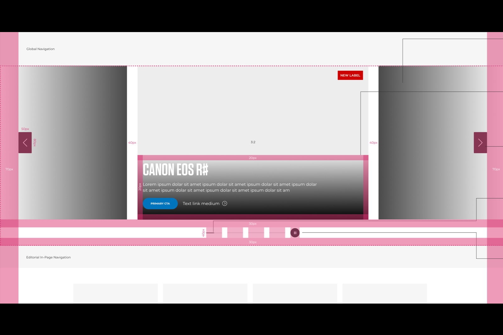
Design
I created sketches, high-fidelity wireframes adhering to the brand guidelines and interactive prototypes to help the team explore different design variations and test their effectiveness. This step helped refine layout, interaction, and responsiveness before development began.
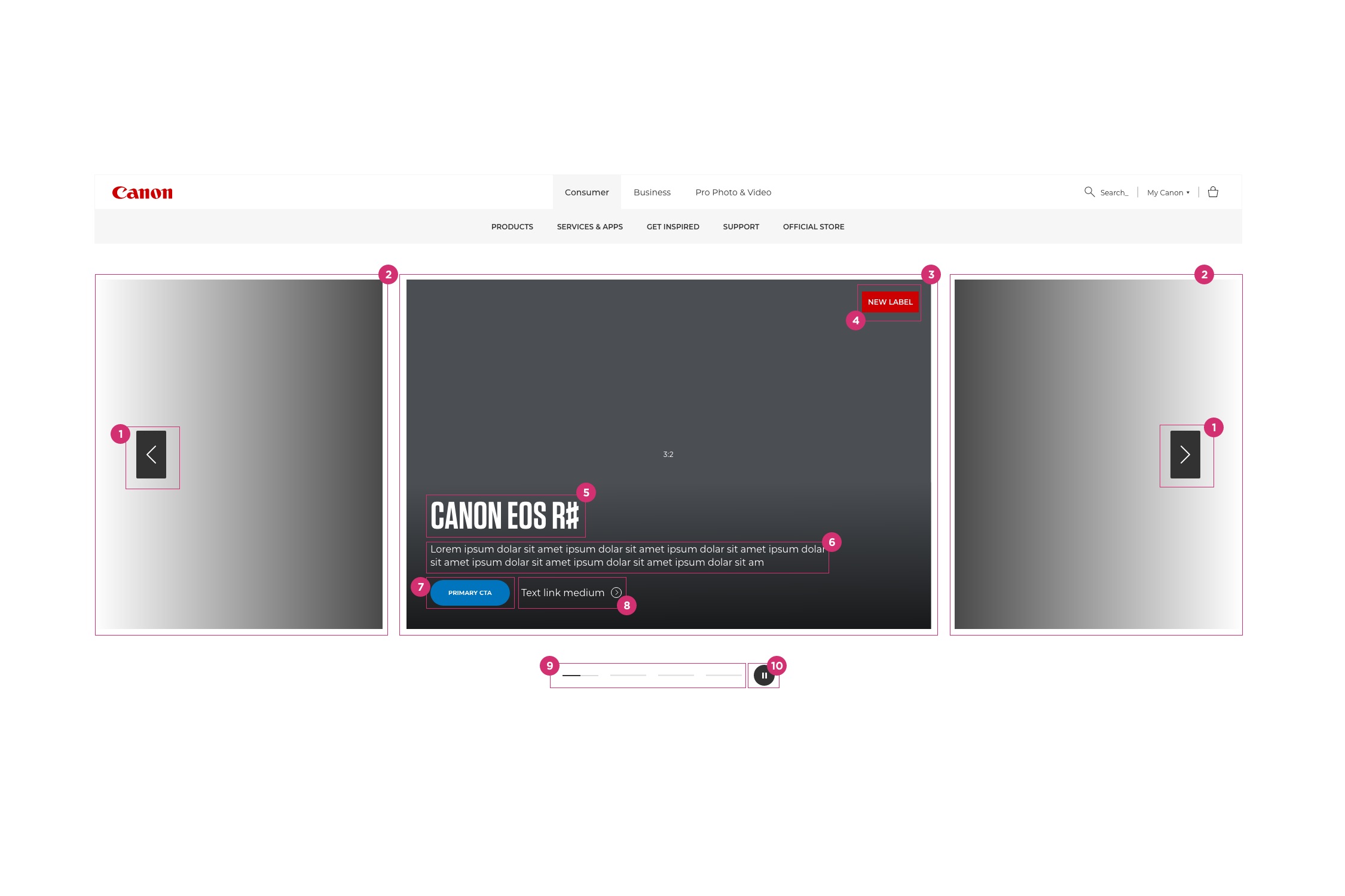
I documented detailed design specifications and worked closely with front-end developers to ensure accurate implementation. Regular weekly check-ins and collaboration ensured that the final product aligned with the intended experience.
Testing
To guarantee a smooth user experience, I conducted quality assurance (QA) with a team of 15 SMEs across digital and marketing, testing the banner across multiple screen sizes to validate responsiveness, functionality, and performance. During this process, the team uncovered several minor usability issues, such as small inconsistencies in navigation controls and layout alignment. These were quickly addressed and resolved, ensuring the banner met quality standards and allowing the project team to confidently move forward to deployment.
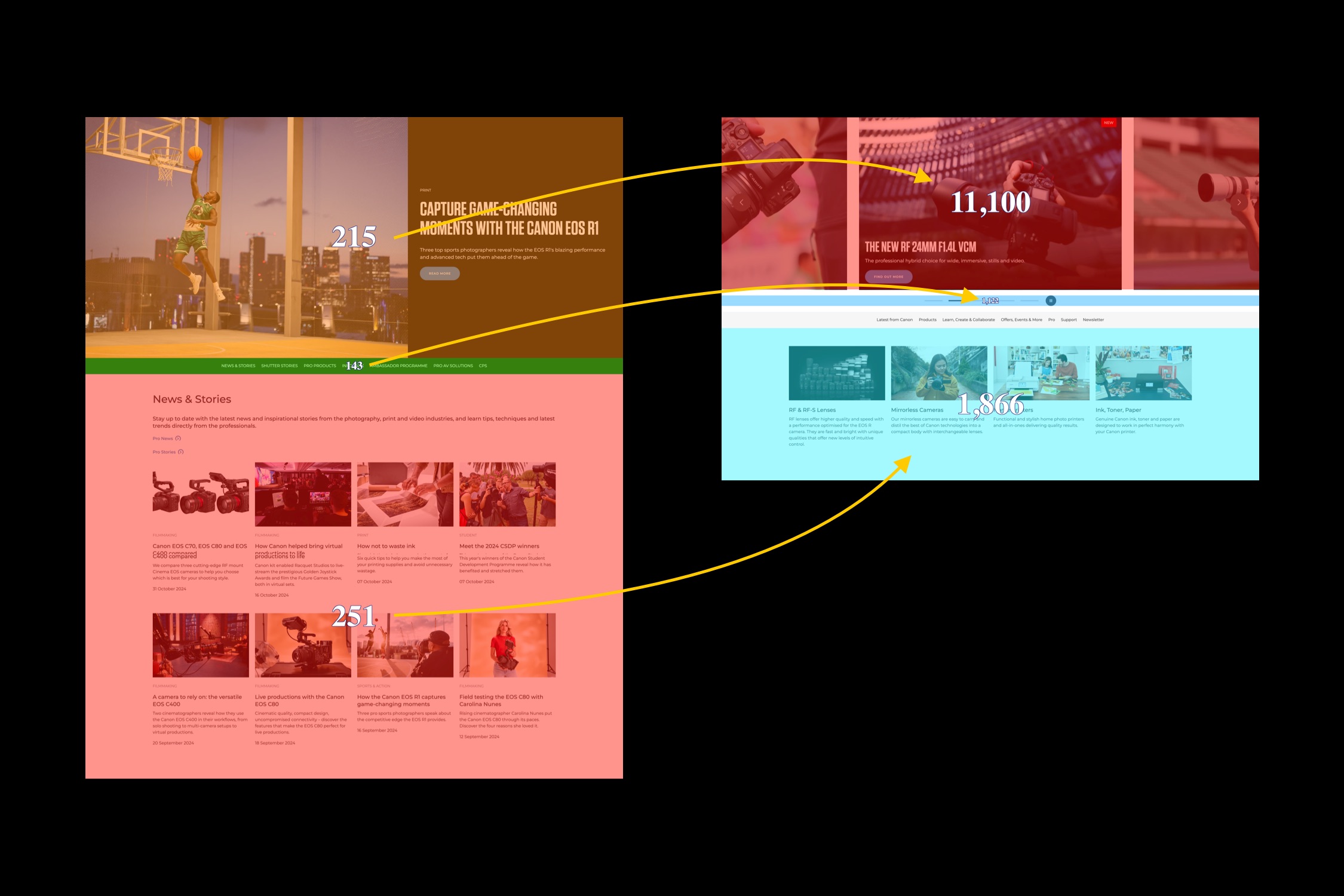
Live Capture
Outcomes
The results of the new pattern demonstrated significant improvements in user interaction and navigation behavior.
- An increase of 5062.79% in total clicks: Users actively engaged with the banner and explored promotions. Individual banner clicks also increased by 641%.
- Increased clicks and exposure to content sitting directly beneath the banner and to the in-page navigation items.
- Higher Product Page Visits: More traffic was driven to featured product pages, boosting awareness.
- Increased Dwell Time: Users spent more time interacting with the banner than before, indicating better engagement with the content.
- Improved Navigation: Increased visits to product landing pages from product pages, suggesting more efficient discovery and browsing behavior.
Uplift
Below, a heatmap captured using ContentSquare demonstrating the impact of the new design.
Let's Talk
Are you passionate about driving value through building compliant, consistent, and accessible digital experiences? If so, get in touch today.
Send a messageLinkedin